
I was looking through this years Heritage and leafing through the Target brown back parallels in my Brewers collection and it made me nostolgic for the cards of yore, when trading cards where printed on cardboard.
So I've compiled a gallery of card backs from Topps cardboard era, 52-91. To be honest most of us are focused on card fronts. The photograph and layout. It's important I won't say it's not, but card backs are where the meat lies. Before a kid could just go look up stats on the internet the card back was the source for how many dinger Mantle hit in 54, how many strike outs Nolan Ryan threw in 1978, what was Brook Robinsons life time RBI total in 1970? And just like the fronts, the backs have had hits and misses

1952. Topps first full set. After issuing it's introductory blue back and red backs baseball game the year before Topps put out this set. And after the company decided to dump the excess inventory from it's last series in the ocean. It made this Mantle card one of card collecting's holy grails. Not a bad design, lots of information, and easy to read, and lets face it the fronts ain't too shabby either.

1953. I'll be honest this is one of my favorite backs. Mainly we see the start of Topps use of comics and trivia. Also a nice color scheme and nice write up on the top. The one draw back is the stats. I prefer the table design. Topps of course would experiment with a couple stat design schemes. I also like the large numbers at the top of the cards.

1954. I think I'm going to run out of things to say that aren't apparently obvious when looking at the card backs. The '54 backs aren't my favorites but I do like the 3 panel comic trivia. Topps was still using the stat format of last year and lifetime, a style that it would use for a few more years.

1955. A nice clean back with all the essential info and of course a trivia cartoon. Similar to the 54's in color and still using the number in the baseball. Like the 54 the card number is in the upper left hand corner, which is great for collating sets. Although I'm sure in 1955 baseball card storage boxes are a few years off.

1956. Another nice clean back with a large comic, not much in the way of narrative.

1957. The first time Topps puts career stats and shows all years on the back of a card, now kids can quiz each other on how many home runs Yogi had in 1953.

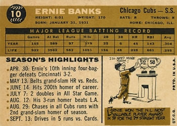
1958. You'll notice for the older cards I've used some pretty significant card backs from some great players. I've been pulling clean images off of auction sites and trying to get good examples. Here we see Topps goes back to the one year of stats and lifetime total and a nice little write up and cartoon.

1959. Topps goes back to full stats, a nice little narrative and a trivia cartoon.
1960. Ah into the 60's. Back to the single year stats. Instead of a narrative we get a bulleted season highlights and a trivia cartoon.

1961. Probably the most memorable back in the 60's for me. Well before my time, but this is the first set of Heritage I tried to actually put together, and I'm still trying to finish.

1962. Topps 10 year anniversary!! And currently this years Heritage release.

1963. Very similar in layout to the 59 set. Here we see topps using complete stats that it would continue to do for the rest of it's releases except for one.

1964. Not one of my favorite backs. All we need is a few off skew blue lines and the backs could have been in 3-D.

1965. I'll say this while this is not one of my favorite backs, the 65's are one of my favorite front designs. Maybe in a few years when Heritage gets to this design and the world hasn't ended I'll try to put another Heritage set together. Although I do like the comic lettering on the card.

1966. A great contrast back. Still using a rounded border like the year before and we'll see the rounded boarder in a couple years. A nice clean card back full of stats with the card number offset in a Topps baseball.

1967. The first of two years that Topps went to the vertical back design.

1968. Again with the vertical card back and the return of rounded borders.

1969. A great set with notable rookies of Reggie Jackson and Rollie Fingers, I do love the umbrella logo on
the back.

1970. While I'm not a huge fan of the front of this set, this is undoubtedly one of my favorite backs and not just because it's Brewers colors. The blue and the yellow offset each other and Topps had never really used much blue in a card back.

1971. Topps decided to go back to basics with it's one year of stats and lifetime, and the fronts with the black borders make this one of the toughest sets to put together in mint condition, well that and Topps centering issues.

1972. Slowly moving into the modern era of cardboard we have the 72's. The fronts featured a art deco style border and lettering, and the back were fairly simple with a nice stat field and small cartoon.

1973. Ah now we are in the modern age. Of course I'm judging this on my age and this was the set of my birth year. Not a terrible design on the front, I do love the silhouetted position players on the front, the back offers us a nice clean vertical design.

1974. A nice layout with a lot going on. Of course in my example I have an early Winfield card players with more stats had fewer bullet facts.

1975. One of my favorite sets, mainly because my favorite Brewer of all time's rookie card is in this set. It also marks the first time Topps prints the copyright date on the bottom of the card.

1976. A great card back with a simple design but with a nice horizontal layout, easy to collate. A cool bat and ball design and of course a trivia comic. I had to put a sophomore card of Brett here since I used Younts card up above.

1977. Another nice back, although Topps went with green again this year. The back is suppose to be a billboard or scoreboard, something like that. The numbers are kinda small on the card but the stand out nicely placed in the baseball.

1978. Orange!

1979. More green, although a little more appealing than the 78's.

1980. Blue.

1981. One of my favorite sets. I love the baseball hats on the front and the backs are a nice two tone red with black accents. It just has good eye appeal. Plus this marks the end of the card back cartoon.

1982. I'm not sure why I like this set so much. I've been slowly putting a set together for few years now. Of course the kicker is that Cal Ripken Jr's rookie is in the set and that makes it slightly pricey.

1983. I guess I'm just going to have to say I love the early 80's set design. 83 is another great set with the action shot and head shot on the front and a nice back with player silhouettes.

1984 carried over the basic front design of the 83 set with a different shape for the head shot. The backs are bolder with a nice team logo and a big card number and personal info set a part with a thick red boarder.

1985. One of my least favorite backs. I still like the front of the 85's and lets face it I consider this the last set before the bad wax era.

1986. I like the back design. Not my favorite but simple effective, I even like the front design, but this set has the dubious designation as the start of the over produced bad wax era.

1987. The modern woodies if you will and the set I first started collecting. And I like the blue and yellow background colors just like the 1970 Topps.

1988. I can't remember why, but I didn't really buy much of this when it came out in 88. Maybe because I really didn't like the front design, it is my least favorite of all the 80's designs. Thank goodness I can still find this now for super cheap. If you pay over 5 bucks a wax box you got ripped off. I also have not been a fan of the orange backs.

1989. We've seen Topps use this color scheme multiple times and it works pretty well. I always like the 89 design and this was the time I really got into baseball. 87 might have been when I first noticed baseball cards but 89 is when I really stated to pay attention. Even though these cards were overproduced and incredibly easy to find it's still a great set visually for me.

1990. The end is near. Wow that back is bright. The Art Deco lettering doesn't do it for me. And the fronts aren't all that great either, but I did buy the hell out of this too. That's what happens when your 16 with a job, plus this stuff was still cheap as chips, and you still got gum!!!

1991. The last regular issue set with cardboard backs. Topps had of course been issuing "Tiffany" sets since 1984 with better card stock and white backs. Topps 40th anniversary, 39th issued set and last of the cardboard backs. Remember wax backs? Remember gum?

1992. Here we have the 92 back. All white and pretty. This is actually a transition. The card stock is better but the back still matte, next year we get really fancy. But this year we also see the start of "gasp" gold foiling!!
Well that's it. That's a lot of card backs and a lot of rambling. It's hard for me to pick on back above all others but I will pick a back a decade that I think is tops, pun intented.
1950's. It's tough, I mean Topps had to try in the 50's to wrestle market share from Bowman. I choose 1953. A great design.
1960's. Again a little harder but there were quite a few dudes in the 60's as card backs go. I'm going to say 1969. I love the umbrella logo on the back.
1970's. This one is easy for me 1970, without a double, but 71 gets an honorable mention with the addition of a player photo on the back. Something we wouldn't see again till the 90's!
1980's. I'm going to say 1981. While Topps would use the two tone red and black color scheme 3 times in this decade the 81's did it best.
1990's. Well my choices are few here since I'm limiting myself to cardboard backs and I'm disqualifying the 92's. So for me it's easy to pick the 91's since the 1990 backs hurt my eyes when I stare that them.
Now I'm not saying that Topps hasn't had some good card backs in the modern days but with the advent of computer design, the old topps cardboard backs, and fronts, that were layout by hand with cartoons and hand lettering, seems like a lost art form.
cb out.
No comments:
Post a Comment